Client: Saronic Ferries
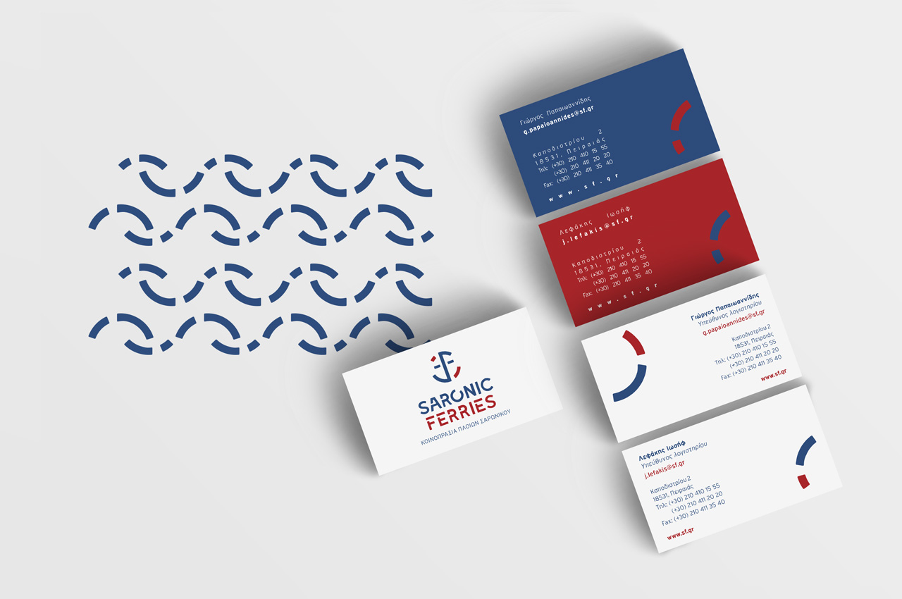
Project: Rebranding logotype & business cards
Saronic Ferries is one of the biggest Greek shipping companies that travel through the islands os Saronic Gulf from the port of Piraeus. Millions of tourists and locals use it throughout the year. One of the requests of the client was to keep some connection with the former logotype but yet, keep a fresh and minimal approach for the trademark.
After several drafts we decided to maintain the main 2 colours of the former identity and the symmetry of it.
The ispiration behind the trademark is the combination of the capital letter S and the anchor symbol. The simplicity of it has made it really easy to implement the aesthetic to numerous applications.
